TOPIC 2 · MAJOR ASSIGNMENT 1 · COMPONENT 01/ Conversions & Budgeting / major assignment / income analysis
01Slope, intercept, and a line that predicts.
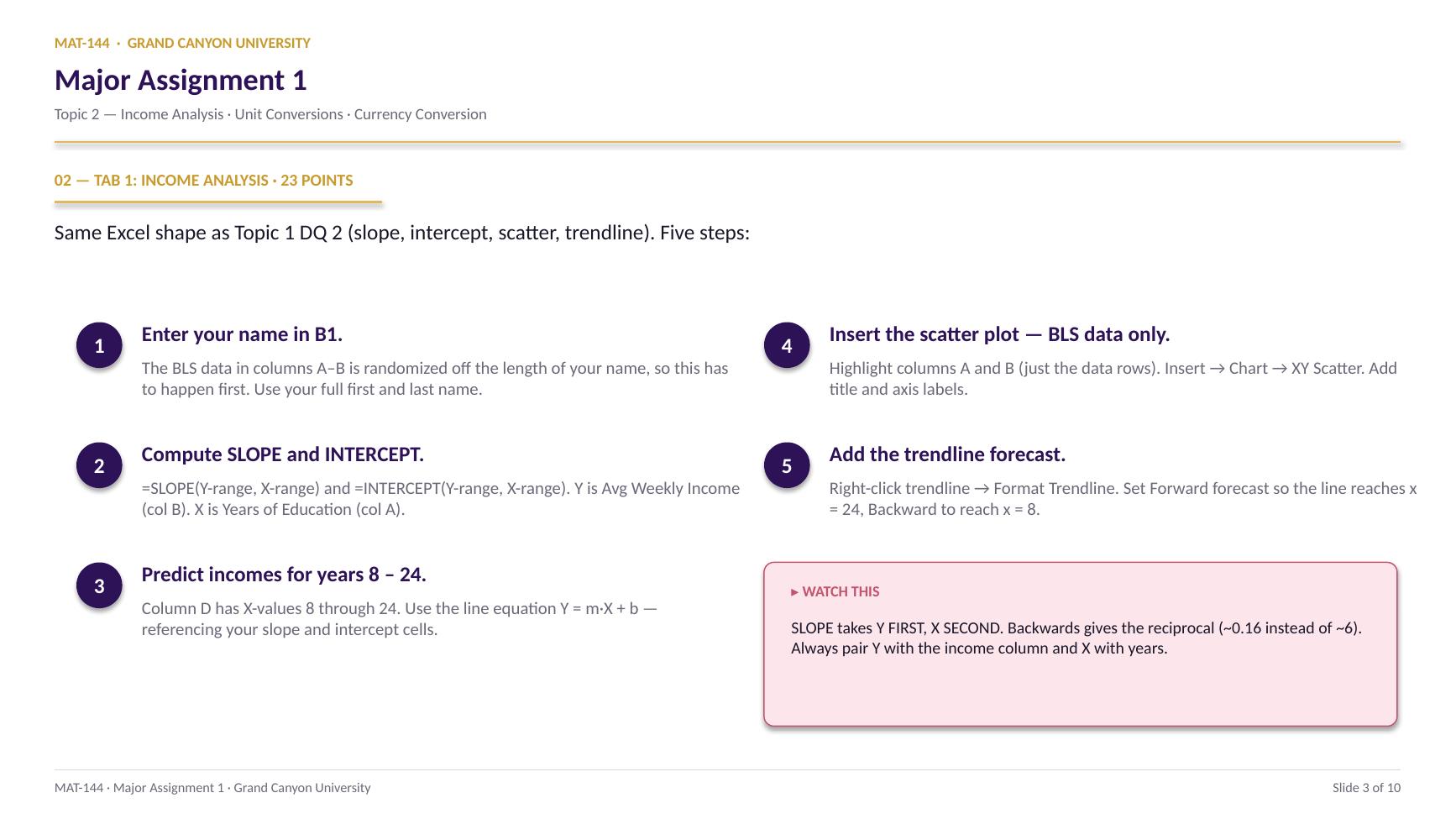
Fit a best-fit line to BLS data on years of education vs. weekly income, then use that line to predict incomes for years 8 through 24. Build the scatter plot and extend the trendline both directions.
Major Assignment · 23 pts
Excel · desktop only
=SLOPE() · =INTERCEPT()
A 7-page MA1 Walkthrough PDF covers all three tabs in the same hint depth as this page. Useful if you'd rather print, annotate on paper, or keep it open on a second screen while working in Excel.
Walkthrough video coming in a future recording. Until then, work from the slideshow above and the printable PDF.
SCRIBE.HOW · YOUTUBE
≡
Step-by-step walkthrough
Coming soon. Check back after the Scribe is recorded.
▸
Video walkthrough
Coming soon. Same material, different medium, recorded over the holiday break.
Same walkthrough, two modes.Use whichever helps you today.
ORIENT
· the tab
Three sections, one workflow.
BLS data on top. Your predictions below. Chart at the bottom.
Your name in cell B1 seeds the data — until you fill it in, every value in column B reads “Enter your name in B1.” Type your full first and last name first, then everything below populates.
§1 · BLS data
Column A (Years), Column B (Income).
Eight rows. Column A holds years of education (X). Column B holds the corresponding average weekly income (Y), randomized off your name.
§2 · Predicted incomes
Column D (Years 8–24), Column E (Predict).
Column D is already filled. Column E is where you'll use the line equation Y = m·X + b to predict income at each year of education.
§3 · Scatter plot
Inserted below the data tables.
Empty for now. You'll insert an XY scatter of the BLS data (columns A and B, not the predicted table) with a trendline extended to x = 8 and x = 24.
CONCEPTS · six things to know
The four moves you'll make.
Each is the same Excel pattern: click cells, never type numbers. Lock the references with dollar signs so formulas copy clean.
01
Slope
=SLOPE() reads rise over run, automatically.
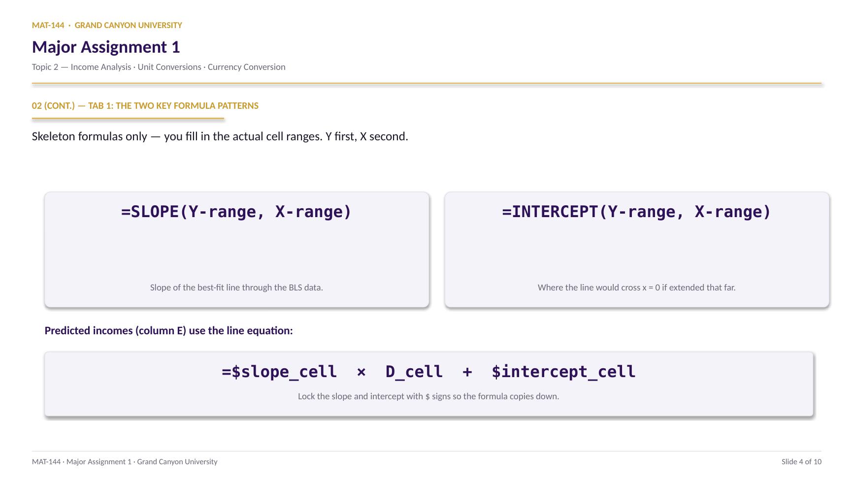
Type =SLOPE(Y-range, X-range) — Y first, X second. Y is your Average Weekly Income column (B). X is Years of Education (A). The function returns the slope of the best-fit line through every (X, Y) pair in the data.
Format the result cell as Number with 0 decimals. The number tells you how many extra dollars per week each additional year of education buys.
=SUM(E21:E28)
=Switch on
SUMFunction name
( )Argument hold
E21:E28Range arg
02
Intercept
=INTERCEPT() finds b.
Same shape as SLOPE: =INTERCEPT(Y-range, X-range), Y first. INTERCEPT returns the predicted Y-value when X = 0 — where the best-fit line would cross the y-axis if extended.
Format as Number with 0 decimals. Read it as “the predicted weekly income at zero years of education” — which is a wild extrapolation, so don't treat the value too literally. It's a parameter, not a real-world prediction.
=SUM(E21:E28)
=Switch on
SUMFunction name
( )Argument hold
E21:E28Range arg
03
Predict
Plug the line equation into every row of column E.
The pattern: =$slope_cell * D_cell + $intercept_cell. Lock the slope and intercept cells with $ signs (e.g., $B$28) so the formula copies cleanly down. The D-cell stays relative so each row picks up its own X-value.
Format column E as Currency with the $ symbol and 0 decimals.
=$slope * D-cell + $intercept
Slope and intercept locked with $. D-cell stays relative.
Copy down column E from row 19 to row 35.
04
Chart
Scatter plot the BLS data only, then add the trendline.
Highlight columns A and B (just the eight data rows). Insert → Chart → XY Scatter. Don't include the predicted-incomes table — that's a separate exercise.
With the chart selected: Chart Design → Add Chart Element → Trendline → Linear. Then right-click the line and pick Format Trendline. Set Forward forecast so the line reaches x = 24, and Backward forecast to reach x = 8. Add a chart title and axis labels via Add Chart Element.
Cell by cell
=(E21+E22+E23+…+E28)/8
⟶
Range, scales freely
=AVERAGE(E21:E28)
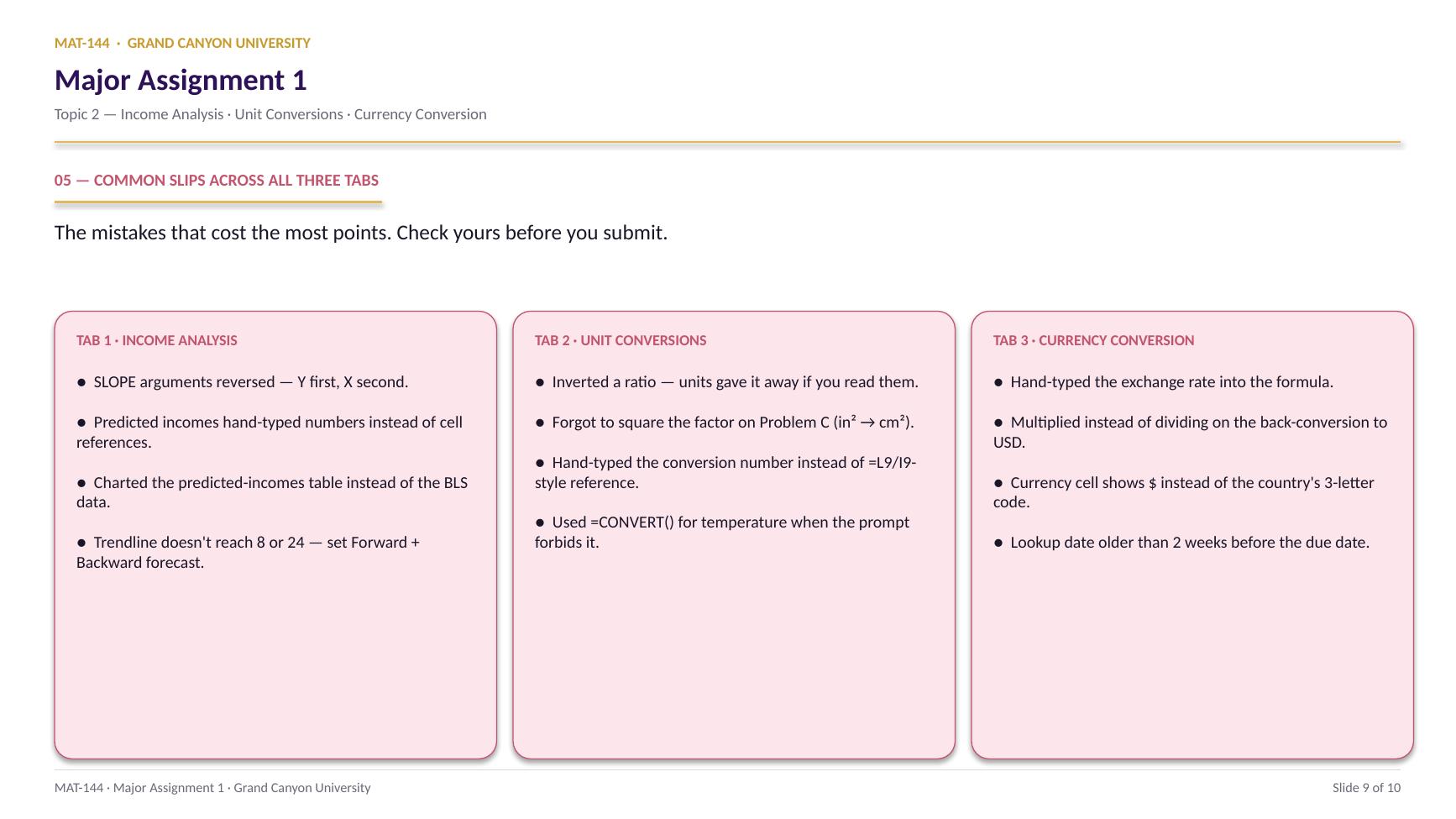
Common slips
Four mistakes that cost the most points.
Check these before you submit. Three out of four are formula-reference issues, not math errors.
01
SLOPE arguments reversed.
=SLOPE(X, Y) returns the reciprocal of the right answer (~0.16 instead of ~6). Y first, X second. ALEKS reads it like “rise over run.”
02
Predicted-incomes formula hand-typed the slope and intercept.
Looks right on the surface, but the auto-grader checks for cell references. Click the slope and intercept cells in your formula instead of typing the numbers. Add dollar signs ($B$28) so references don't shift when you copy down.
03
Charted the wrong range.
If your scatter plot has dots at (8, 0), (9, 0), … you selected the predicted-incomes table (D and E) instead of the BLS data (A and B). Click the chart, “Select Data,” and point at columns A and B for the BLS data only.
04
Trendline doesn't extend to 8 or 24.
Right-click the trendline → Format Trendline. Set Forward forecast and Backward forecast so the line reaches from x = 8 to x = 24, even though the data only spans 10–20.
Application & connection
This is Topic 1, in spreadsheet form.
Slope and y-intercept are the Topic 1 move. The Excel functions =SLOPE() and =INTERCEPT() just automate what you'd do by hand with two points: divide rise by run, then back-solve for b. Read your output as a story: the slope tells you how many extra dollars per week each year of education buys, and the intercept is the predicted income at zero years (which is a wild extrapolation, hence the chart's lower bound at 8).
If the math feels distant, jump back to Topic 1 Lesson 4 (Slope) and Lesson 5 (Linear Modeling) for a refresh. The Excel shape is also very similar to Topic 1 DQ 1: cell references in formulas, gold cells for the math, blue cells for text, number formatting at the end.