TOPIC 1 · DQ 2/ Linear models / discussion question
02Find the line, and use it.
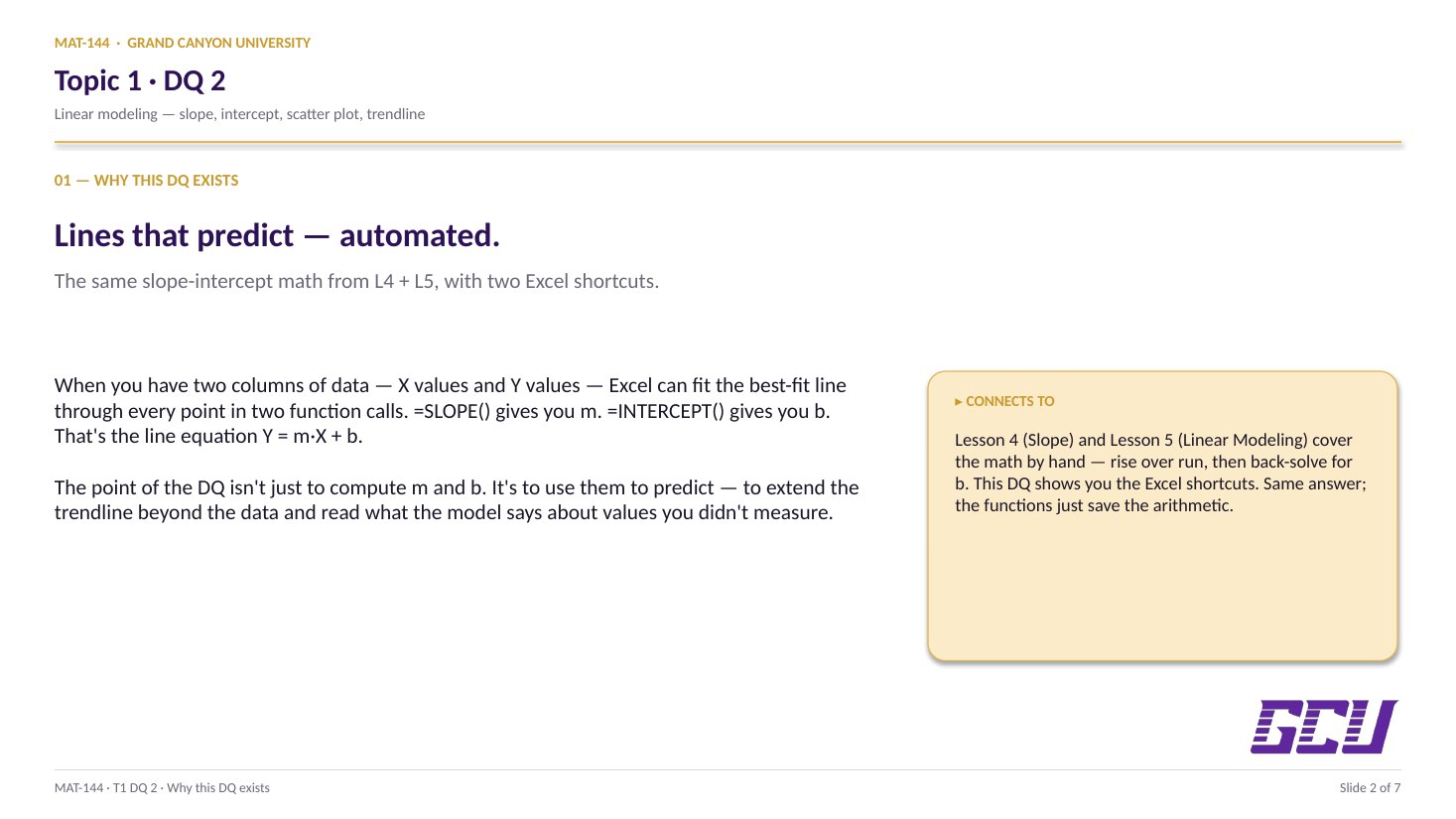
A 6-point dataset, two function calls, and one prediction equation. The week your equation becomes a tool you can extend to numbers Excel hasn't seen yet.
Discussion · 5 pts
Initial post Fri · replies Sun
SLOPE & INTERCEPT
Linear modeling
Thirty-two steps from raw data to a fitted line. Pause anywhere; the embed scrolls independently of the page.
SCRIBE.HOW · YOUTUBE
Same walkthrough, two modes.Use whichever helps you today.
ORIENT
· the worksheet
What's actually on the sheet.
Five regions, one tab. Skim them before opening the file so the formulas have a home.
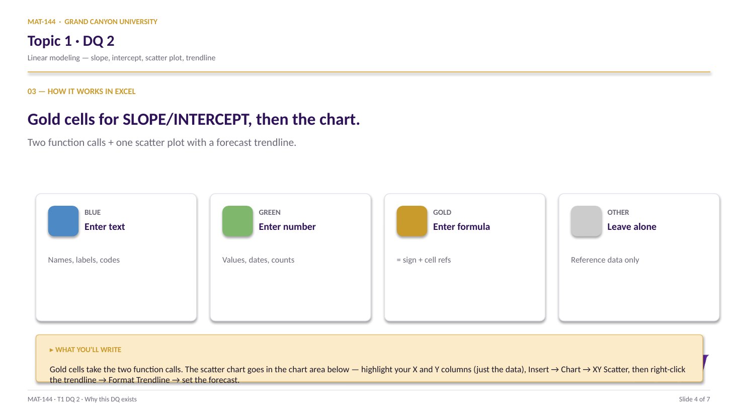
The Linear Fit tab gives you six (speed, stopping distance) measurements and asks two questions: what's the line that best fits this data, and what does it predict for speeds we didn't measure? You answer both with two SLOPE/INTERCEPT calls and a single fill-down formula.
§1 · Fit the line
SLOPE, INTERCEPT, and the equation.
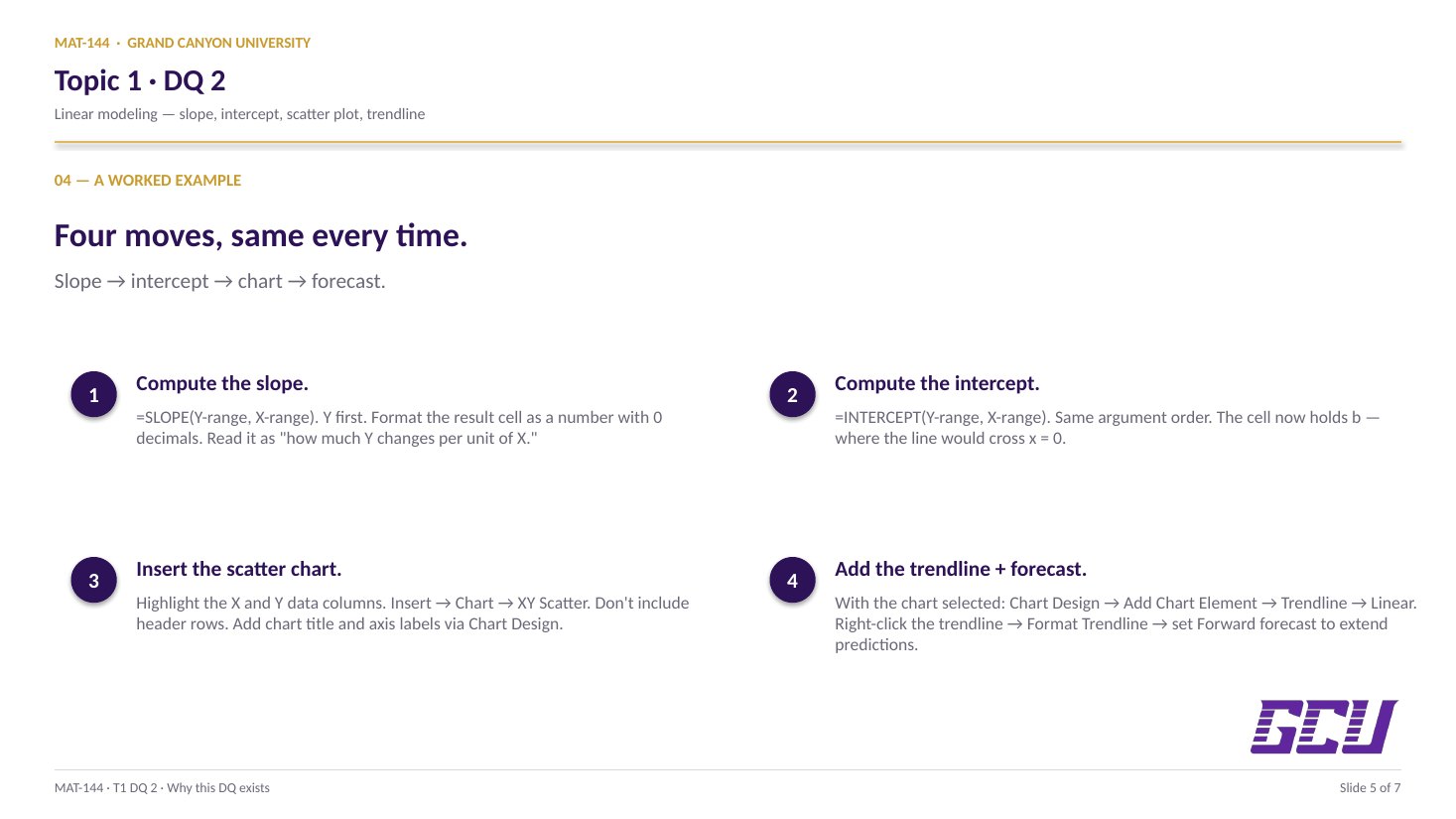
Two functions on the raw data give you the slope (m, ≈6.21) and intercept (b, ≈−59.92). Format both to 2 decimals, then write the prediction equation as text in B31: d = 6.21s − 59.92.
§2 · Use the line
Predict, plot, and read off.
A single formula in F17 with absolute references to slope/intercept fills down to F27, predicting eleven distances. Then a scatter plot with a linear trendline lets you read off three answers.
CONCEPTS · six things to know
The why behind every formula.
Six ideas to internalize. Skip them and the formulas still work today; understand them and they keep working for the rest of the course.
01
Data
Raw data lives in two columns.
The Linear Fit tab gives you six measurements stretched across
two columns: speed in column B (B17:B22),
stopping distance in column C (C17:C22). One row
per data point. The numbers are personalized by your name, so your
classmate's slope and intercept won't match yours.
The header row is doing real work. (s)peed (m/s)
and (d)istance (m) tell you which column is the
independent variable (x) and which is the dependent variable (y).
Excel's regression functions need that distinction; you supply it
through the cell ranges you hand them.
Both columns get headers because the y-values aren't more
important than the x-values, they're just different. Reverse them
in the formula and the slope sign flips.
B
C
15
(s)peed (m/s)
(d)istance (m)
17
13
27.33
18
18
49.99
19
23
79.58
20
21
64.99
21
25
92.21
22
30
133.68
B17:B22 = x (speed)C17:C22 = y (distance)
02
Pattern
y first, x second.
Excel's regression functions share the universal shape
=NAME(arguments), but their argument order
matters more than usual.
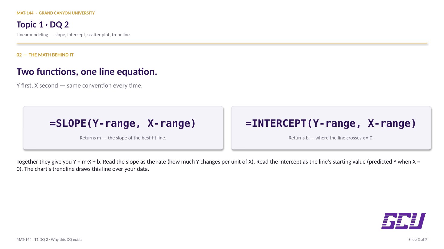
=SLOPE(known_ys, known_xs). The y-values come
first. The x-values come second. Same for INTERCEPT. Same for
FORECAST and TREND when you meet them later.
Reverse the order and Excel won't error. It will quietly give
you a slope that's 1 over the right answer, an
intercept on the wrong axis, and a graph that looks fine until
someone checks the math. The arguments are not interchangeable.
=SLOPE(C17:C22, B17:B22)
SLOPEFunction name
C17:C22known_ys (y first)
B17:B22known_xs (x second)
,Required separator
03
Meaning
Slope and intercept have meaning.
Slope and intercept aren't just numbers Excel computes. They
have physical meaning, and on this DQ you're asked to read them
back out and write a sentence interpreting each one.
Slope is the rate of change. For this data,
slope ≈ 6.21 means: for every 1 m/s increase in speed,
the predicted stopping distance increases by 6.21 m. A real
claim with units (meters per meter-per-second).
Intercept is where the line crosses the y-axis,
the predicted value when x = 0. Here intercept ≈
−59.92, which says: at 0 m/s, the line predicts a
stopping distance of −59.92 m. That's nonsense
physically (a stationary car has zero stopping distance), but
mathematically the intercept is real. It's the price of using a
straight line to fit data that probably curves at low speeds.
slope (m)
6.21
Per 1 m/s of speed, distance grows 6.21 m
intercept (b)
−59.92
At 0 m/s, the line predicts −59.92 m
04
Equation
y = mx + b, assembled from cells.
Once you have slope and intercept, you have the entire line.
The general form is y = mx + b: y is what you're
predicting, m is the slope, x is the input, b is the intercept.
Swap in the variables: d = m·s + b. Then
swap in the numbers from B26 and B25:
d = 6.21s − 59.92. (The minus sign appears
because b is negative.)
That single line of text is the deliverable for cell B31.
Round both numbers first. The cells contain
something like 6.20987839 and −59.91680821; the equation
should use 6.21 and −59.92.
Cell B31
d = 6.21s − 59.92
slope lives in B26 · intercept lives in B25
05
F17
=$B$26 · E17 + $B$25
F18
=$B$26 · E18 + $B$25
F19
=$B$26 · E19 + $B$25
$ LOCKED · ROW MOVES · $ LOCKED
Anchor
Lock the constants, let the variable move.
The prediction formula in F17 is
=$B$26*E17+$B$25. The dollar signs aren't decoration.
They're locks.
Excel's default behavior is relative references:
when you copy or drag a formula, every cell reference shifts by the
same offset. Drag F17 down to F18 and a plain B26
would shift to B27, and E17 would shift
to E18. That's what you want for the speed input
(E17 → E18 → E19 walks through your speed list), but
it's not what you want for the slope and intercept (B26
and B25 should stay put on every row).
The fix is $ in front of the row and column you
want to lock. $B$26 says "always look at B26, no
matter where this formula moves." E17 with no dollars
stays relative. Drag F17 down through F27 and only the speed
reference advances. Slope and intercept stay anchored.
06
Visualize
Scatter + trendline = the model on paper.
The cell-side work gives you slope, intercept, equation, and
eleven predictions. The chart-side work proves they're consistent.
Insert a scatter plot of the six raw data points
(B17:C22). Add a linear trendline through them. Check
"Display Equation on chart" to make Excel show
its own slope/intercept calculation right on the plot.
It should match yours to 2 decimals. If not,
something disagrees, and the cells are usually wrong.
Then extend the trendline forward and backward 10 periods so
the line shows where your predictions live (including that
nonsensical −59.92 at speed 0). The chart's job isn't to
compute anything new; it's to convince you the line you drew
through the data is the one your formulas describe.
Common slips
Five mistakes that bite first-timers.
Read these before you submit. The dollar-sign mistake alone accounts for half of office-hours questions on this DQ.
01
Forgot the dollar signs.
Wrote =B26*E17+B25 instead of =$B$26*E17+$B$25. F17 looks right; F18 onward gives nonsense because the slope reference shifted to B27, which is empty.
02
Reversed SLOPE/INTERCEPT argument order.
Typed =SLOPE(B17:B22, C17:C22) instead of =SLOPE(C17:C22, B17:B22). The number returns reciprocal-shaped (~0.16 instead of 6.21), and the trendline equation on the chart won't match.
03
Wrote the equation with unrounded values.
Cell B31 should read d = 6.21s − 59.92, using the displayed (rounded) slope and intercept, not the underlying 12-digit numbers.
04
Trendline forecast not extended.
The Forward and Backward forecasts default to 0, so the chart's line ends at the data points. Set both to 10 so the line extends to where your predictions live.
05
Charted the wrong range.
Highlighted B17:C27 (through the empty rows) and got a bunch of zeros at the bottom. Highlight just B17:C22 for the scatter; let the trendline's forecast handle extending past the measured speeds.
Application & connection
From data, to line, to prediction.
DQ 2 pushes on linear modeling — taking a real
situation and writing it as "base amount plus rate times time."
You'll use this exact pattern in Topic 2 (budgeting) and Topic 3
(savings), so it's worth getting your notation consistent now. One small
gift to future-you: write down what each variable means directly on the
spreadsheet, in the cell above or next to it. Two weeks from now, you'll
open the file and not have to guess.