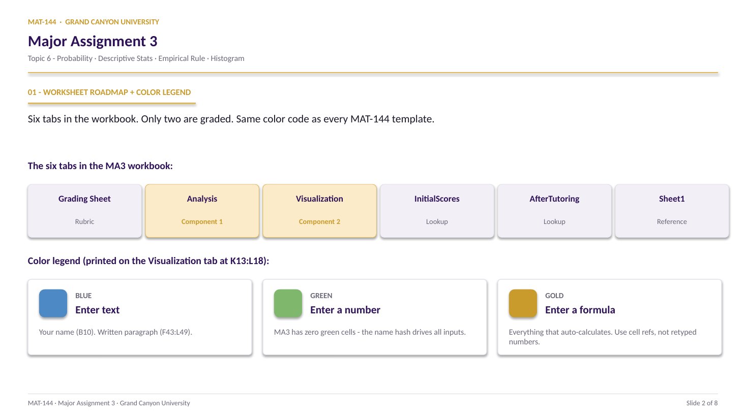
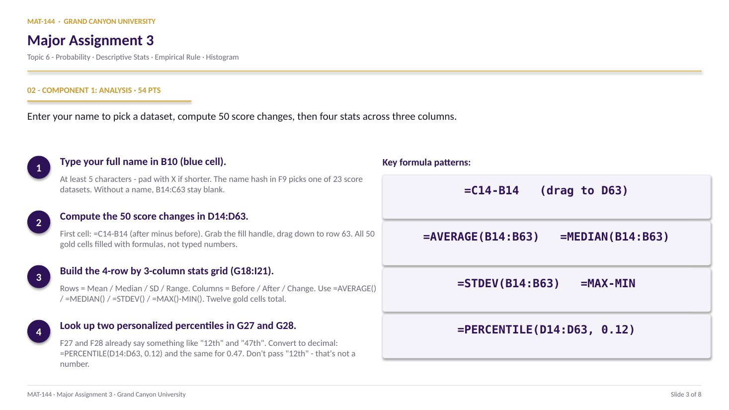
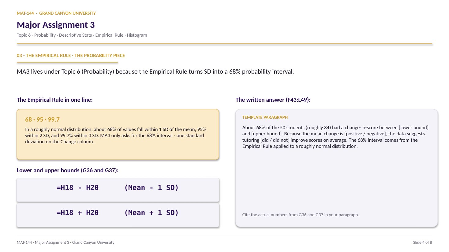
TOPIC 6 · MAJOR ASSIGNMENT 3 · COMPONENT 02/ Probability / major assignment / visualization
02Eleven bins, zero gap, one histogram.
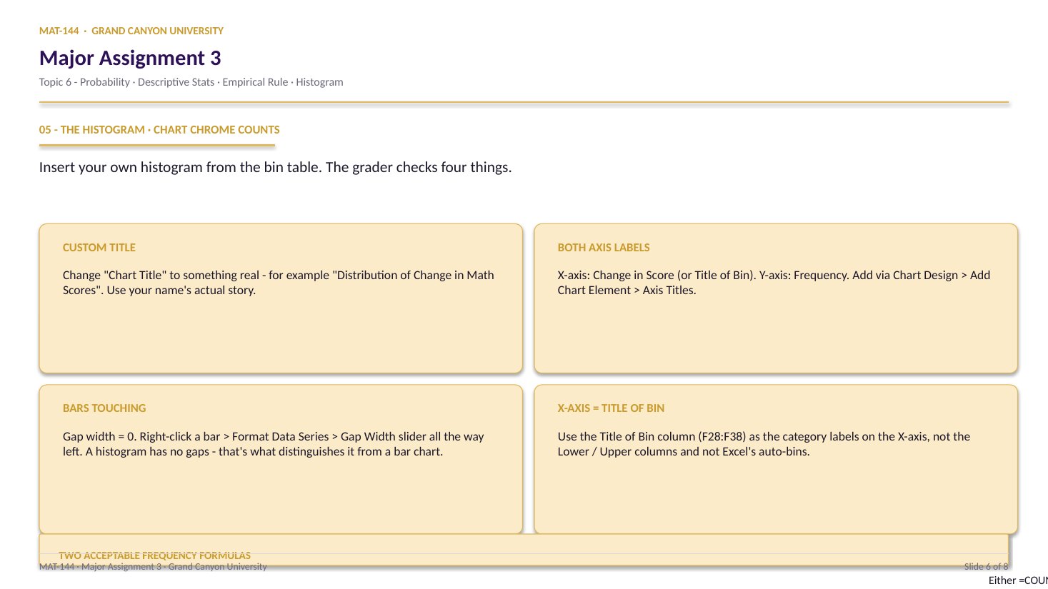
Pull the 50 Change values from Analysis. Compute Bin Min / Max / Width with the critical 0.1 buffer. Fill 11 rows of Lower / Upper / Title / Frequency / Rel-Freq. Insert a histogram with a custom title, both axis labels, and bars touching.
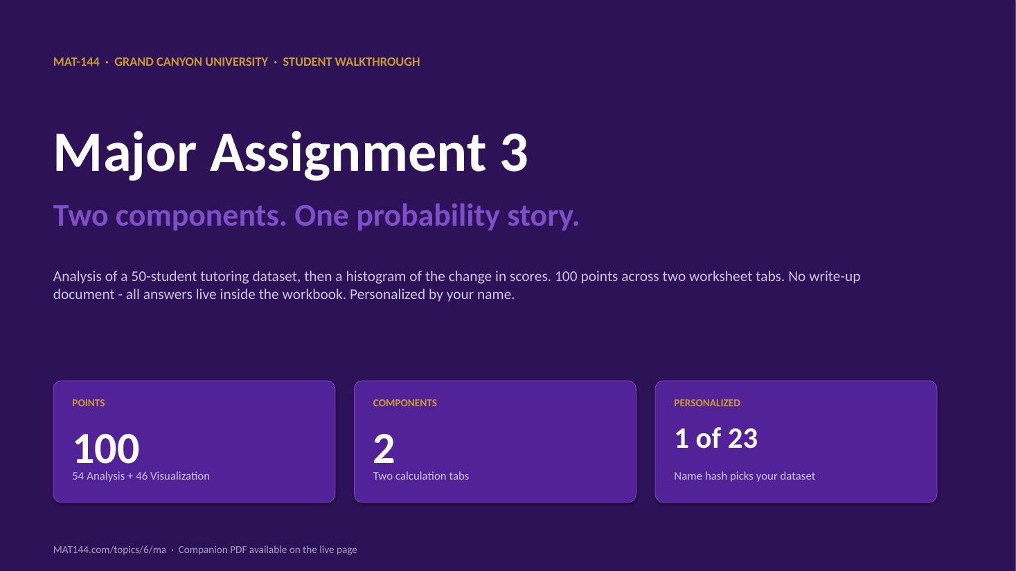
Major Assignment · 46 of 100 pts
11 bins
=COUNTIFS() · Gap Width = 0%
A 6-page MA3 Walkthrough PDF covers both components in the same hint depth as this page. Useful if you'd rather print, annotate on paper, or keep it open on a second screen while working in Excel.
Walkthrough video coming in a future recording. Until then, work from the slideshow above and the printable PDF.
SCRIBE.HOW · YOUTUBE
≡
Step-by-step walkthrough
Coming soon. Check back after the Scribe is recorded.
▸
Video walkthrough
Coming soon. Same material, different medium, recorded over the holiday break.
Same walkthrough, two modes.Use whichever helps you today.
ORIENT
· the tab
Buffer first, then 11 bins, then the chart.
The 0.1 buffer on Bin Min / Max is the entire ballgame. After that, the frequency table is one row of formulas copied down, and the histogram is four chrome edits away from rubric-ready.
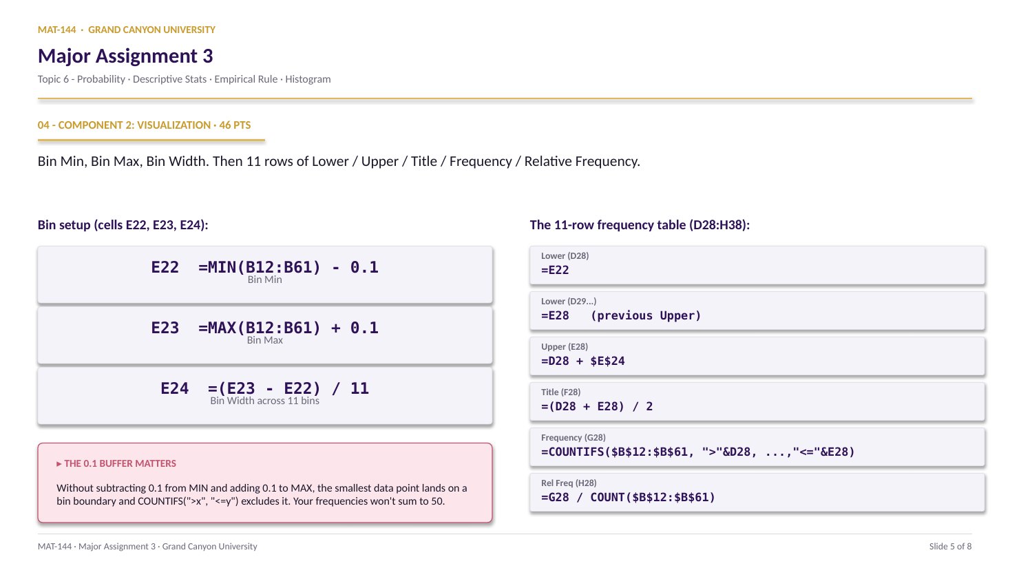
Cells B12:B61 auto-pull the 50 Change values from Analysis. You don’t input anything. Gold cells E22:E24 compute Bin Min, Bin Max, and Bin Width - with the 0.1 buffer baked in. Then D28:H38 is the 11-row table, and the histogram anchors near E48.
§1 · Bin parameters
E22 = MIN - 0.1 · E23 = MAX + 0.1 · E24 = (range)/11.
All three computed, not typed. The 0.1 buffer keeps the smallest value inside bin 1 instead of on its boundary - critical for COUNTIFS.
§2 · Limits
D28 from E22 · D29 from E28 · E = D + Bin Width.
First Lower Limit is Bin Min. Subsequent Lower Limits chain off the previous Upper. Upper Limits are always Lower + Bin Width. Drag the formulas down 11 rows.
§3 · Counts
F = midpoint · G = COUNTIFS · H = G / N.
Title of Bin is the midpoint between Lower and Upper. Frequency uses COUNTIFS with strictly-greater on Lower and less-than-or-equal on Upper. Relative Frequency divides by 50.
§4 · Histogram
Pick F + G → Insert → Column · gap = 0%.
Custom title, both axis labels, bars touching. Right-click a bar → Format Data Series → Gap Width 0%. That last edit is what turns a column chart into a histogram.
CONCEPTS · six things to know
The four moves that drive the chart.
Buffer, then bin, then count, then chrome. Sum the Frequency column - it must equal 50. If not, the buffer is missing or the COUNTIFS bounds are wrong.
01
Buffer
The 0.1 buffer is not decorative.
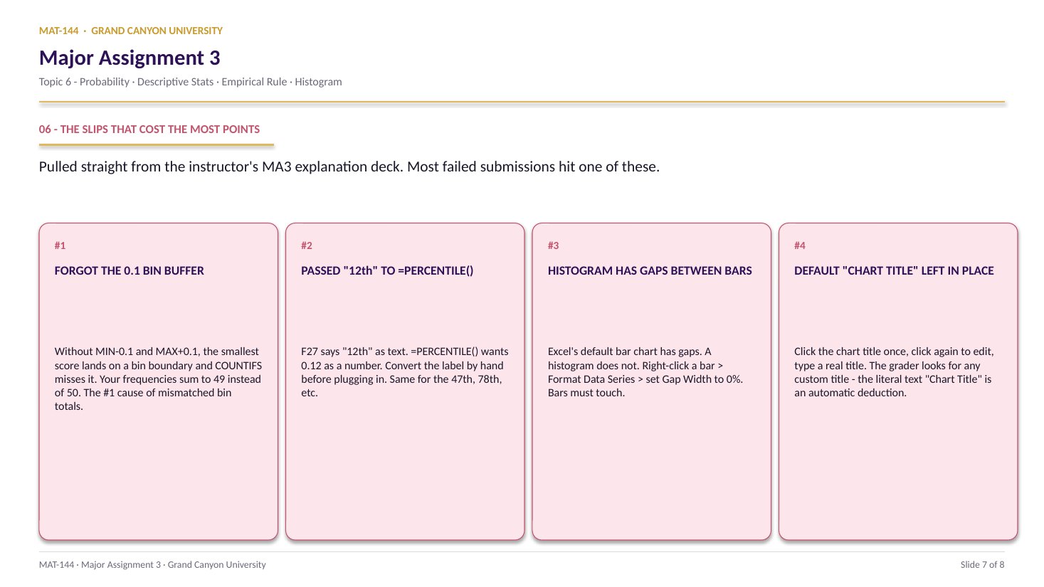
Cell E22 needs =MIN(B12:B61) - 0.1. Cell E23 needs =MAX(B12:B61) + 0.1. Without the subtract / add, the smallest value lands on the first bin boundary. The COUNTIFS rule is ">" - strictly greater - so the smallest value gets excluded and your frequencies sum to 49 instead of 50.
This is the #1 instructor-flagged slip on the tab. Slide 8 of the explanation deck calls it out by name. Self-check: =SUM(G28:G38) must equal 50. If it equals 49, the buffer is missing. Fix E22 and E23 first.
E22 = =MIN(B12:B61) - 0.1
Keeps the smallest data point inside bin 1.
Without it, COUNTIFS excludes the boundary value.
02
Bin Width
=(E23 - E22) / 11 - not a typed number.
Cell E24 needs the formula =(E23 - E22) / 11. The width of one bin is the total range divided by 11. The grader audits the formula bar; if you type a decimal directly (even the correct one), it reads as zero credit.
Every Upper Limit in column E references $E$24 with dollar signs so the width stays constant as you drag the formula down 11 rows: =D28 + $E$24, =D29 + $E$24, and so on.
a + b
↓
a+b
Plus
a − b
↓
a-b
Minus
a × b
↓
a*b
Asterisk
a ÷ b
↓
a/b
Slash
ab
↓
a^b
Caret
03
COUNTIFS
">"&lower, "<="&upper - the boundary fix.
Cell G28 (first Frequency cell): =COUNTIFS($B$12:$B$61, ">"&D28, $B$12:$B$61, "<="&E28). The first criterion is strictly greater than the Lower Limit; the second is less than or equal to the Upper Limit. That <= on the upper side is what keeps each value in exactly one bin.
Anchor the data range with $B$12:$B$61 so it doesn’t walk as you drag the formula down. The Lower / Upper references (D28, E28) do walk - one row at a time. Alternative: an array formula =FREQUENCY(B12:B61, E28:E37) entered with Ctrl+Shift+Enter also works. Either gets credit.
Strictly > on lower, <= on upper. Each value lands in exactly one bin.
Anchor B12:B61 with $; let D28 and E28 walk down.
04
Relative
Relative frequency = empirical probability.
Cell H28: =G28 / COUNT($B$12:$B$61). Each bin’s count divided by the total count (50). Format as Percentage. The 11 values in column H should sum to 100% (or 1.00 in decimal).
This is the bridge between Topic 5 and Topic 6. The relative frequency in each bin is the empirical probability that a random student’s Change score falls in that range. As you collect more data, those relative frequencies converge on the true probability density - that is the Law of Large Numbers in action.
Cell by cell
=(E21+E22+E23+…+E28)/8
⟶
Range, scales freely
=AVERAGE(E21:E28)
05
·
B8+C8TEXT · LABEL
— PRESS = —
=
=B8+C815
Chrome
Title, axis labels, bars touching.
Select F28:F38 (Title of Bin) and G28:G38 (Frequency) together. Insert → Chart → Column. Anchor at E48. Then four required edits:
Chart Title. Click placeholder, type Frequency of Change in Scores.
X-axis label. Chart Design → Add Chart Element → Axis Titles → Primary Horizontal. Type Change in Score (midpoint).
Y-axis label. Same menu, Primary Vertical. Type Frequency.
Gap Width = 0%. Right-click a bar → Format Data Series → slide Gap Width to 0%. Bars now touch - that is what turns a column chart into a histogram.
Common slips
Four mistakes that cost the most points.
The 0.1 buffer is the instructor’s top flag - the single most-cited reason a student’s frequencies don’t sum to 50. Read your SUM total before you submit.
01
Missing 0.1 buffer on Bin Min / Max.
Instructor’s #1 flag.E22 = =MIN(B12:B61) - 0.1 and E23 = =MAX(B12:B61) + 0.1. Without the buffer, the smallest data point lands on the bin boundary and COUNTIFS excludes it. Frequencies sum to 49 instead of 50. Sum the column G and verify before submitting.
02
Used Excel’s default histogram tool.
Insert → Histogram (the auto-bin option) creates its own bins, which won’t match your 11 fixed bins. The grader checks against your D28:H38 table. Use Insert → Column on F28:F38 and G28:G38 instead.
03
Chart title still says “Chart Title.”
Click the title once to select, then again to edit. Type something specific - Frequency of Change in Scores. The default placeholder loses points every time.
04
Bars not touching - default gap width left in.
A column chart leaves a gap between adjacent bars. A histogram has zero gap. Right-click a bar → Format Data Series → Gap Width slider to 0%. That single edit is what converts the column chart into a proper histogram.
Application & connection
This is relative frequency = empirical probability, made visible.
This component is frequency distribution as probability. The 11-row table at D28:H38 is the Topic 5 frequency-table structure from Lesson 1 (Frequency Tables and Histograms), extended with the relative-frequency column that converts counts into empirical probabilities.
The histogram is the visual twin of the Empirical Rule interval from Component 1. If your lower / upper bounds (Analysis!G36, G37) sit on the horizontal axis, you should see roughly 34 of the 50 students (~68%) land between them. The Topic 6 Review Question on frequency distributions walks through a similar table-to-chart workflow with a smaller dataset.
The biggest single point-loss on this tab is the 0.1 buffer. If your Frequency column doesn’t sum to 50 - usually 49, because the smallest value got excluded - go back to E22 and E23 and make sure they subtract / add the buffer. The Topic 6 cheat sheet lists the COUNTIFS shape and the gap-width edit in one place.