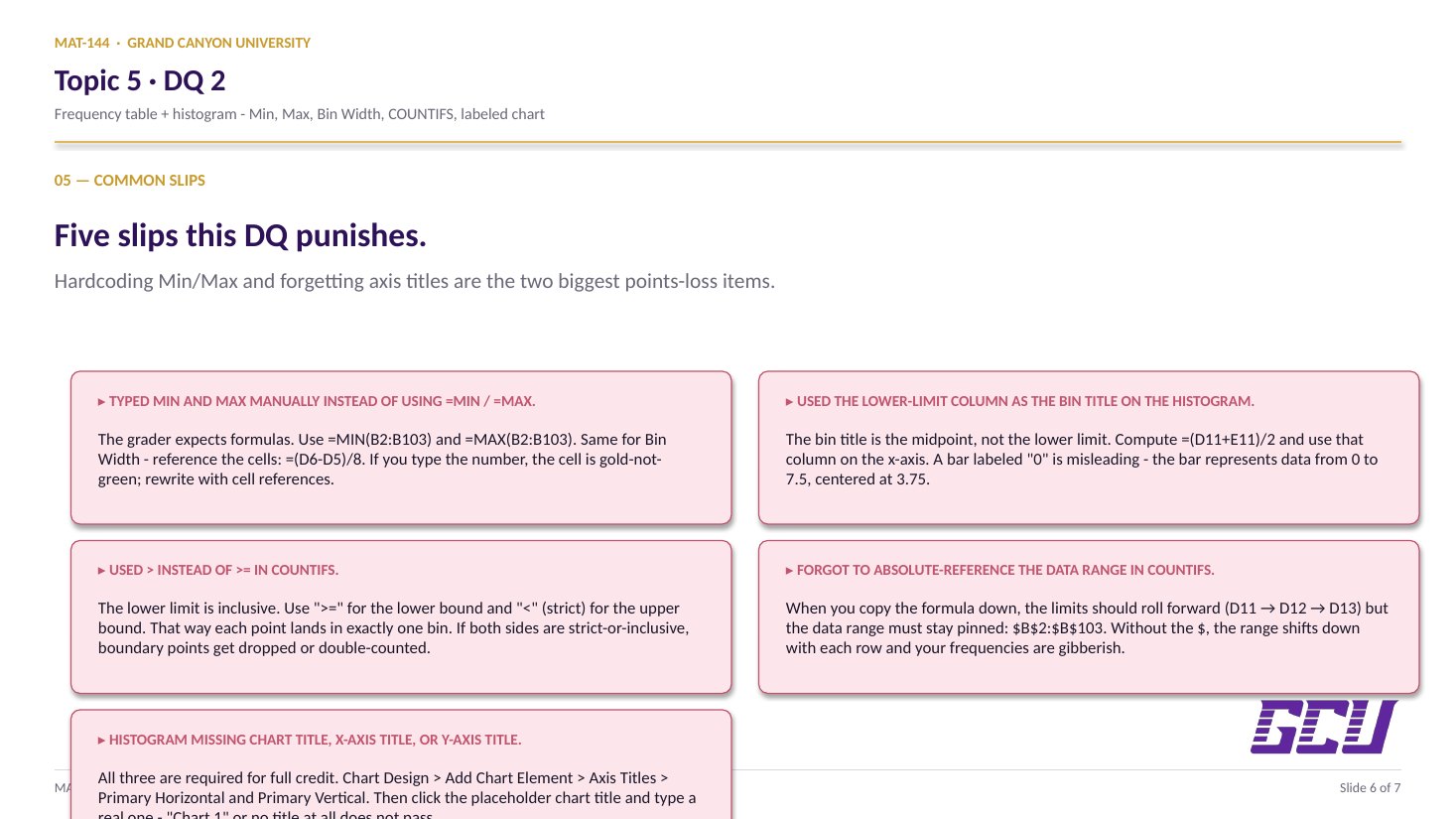
TOPIC 5 · DQ 2 / Statistics / discussion question

02From numbers to shape.

102 wells, one column of data, one frequency-distribution table, one histogram. The bell-shaped picture underneath DQ 1's percentile band.

Discussion · 5 pts Initial post Fri · replies Sun =COUNTIFS histogram
1
Step 1 · materials
Download the worksheet

Topic_5_DQ_2.xlsx

XLSX 5 pts v · spring 26
2
Step 2 · walkthrough
Watch the click-by-click

Every keystroke for the Water Quality tab. The Scribe walkthrough lands here once recorded; for now, the Excel template above is your working surface.

SCRIBE.HOW · YOUTUBE
Step-by-step walkthrough
Coming soon. Check back after the Scribe is recorded.
Same walkthrough, two modes. Use whichever helps you today.
ORIENT · the worksheet

What's actually on the sheet.

One main tab (Water Quality). 102 rows of data appear after you type your name. Same color legend as DQ 1.

Open the Water Quality tab. Type your name in cell D2 — that triggers the data in column B (rows 2 through 103) to populate via NORM.INV. Compute Min, Max, and Bin Width in D5, D6, D7 (format to 1 decimal). Then build the frequency-distribution table: lower limit, upper limit, bin title (midpoint), frequency (via =COUNTIFS), and relative frequency (percentage). Finally, insert a histogram below the table with chart title, x-axis title, y-axis title, and bin midpoints on the x-axis. New to the cell color codes? See the legend.

§1 · Type your name

The data appears.

Cell D2 drives the IF wrapper in column B. Until you type your name, every row shows "Enter Name" as a placeholder.

§2 · Min / Max / Bin Width

Set up the bins.

=MIN and =MAX on B2:B103. Pick a bin width (about (max−min)/8). Format all three to 1 decimal.

§3 · Frequency table

Lower, upper, title, freq, rel-freq.

Lower limit rolls forward from the previous upper. Bin title = midpoint. Frequency via =COUNTIFS. Relative frequency = freq / 102, formatted as %.

§4 · Histogram

Insert + label.

Select bin titles + frequencies, Insert → Column Chart. Add chart title, x-axis title, y-axis title. The grader checks for all three.

CONCEPTS · six things to know

The why behind every cell.

Six panels: Min/Max/Bin Width setup, the bin table, COUNTIFS for frequency, relative frequency as a percentage, and the histogram with its three required labels.

01
Setup

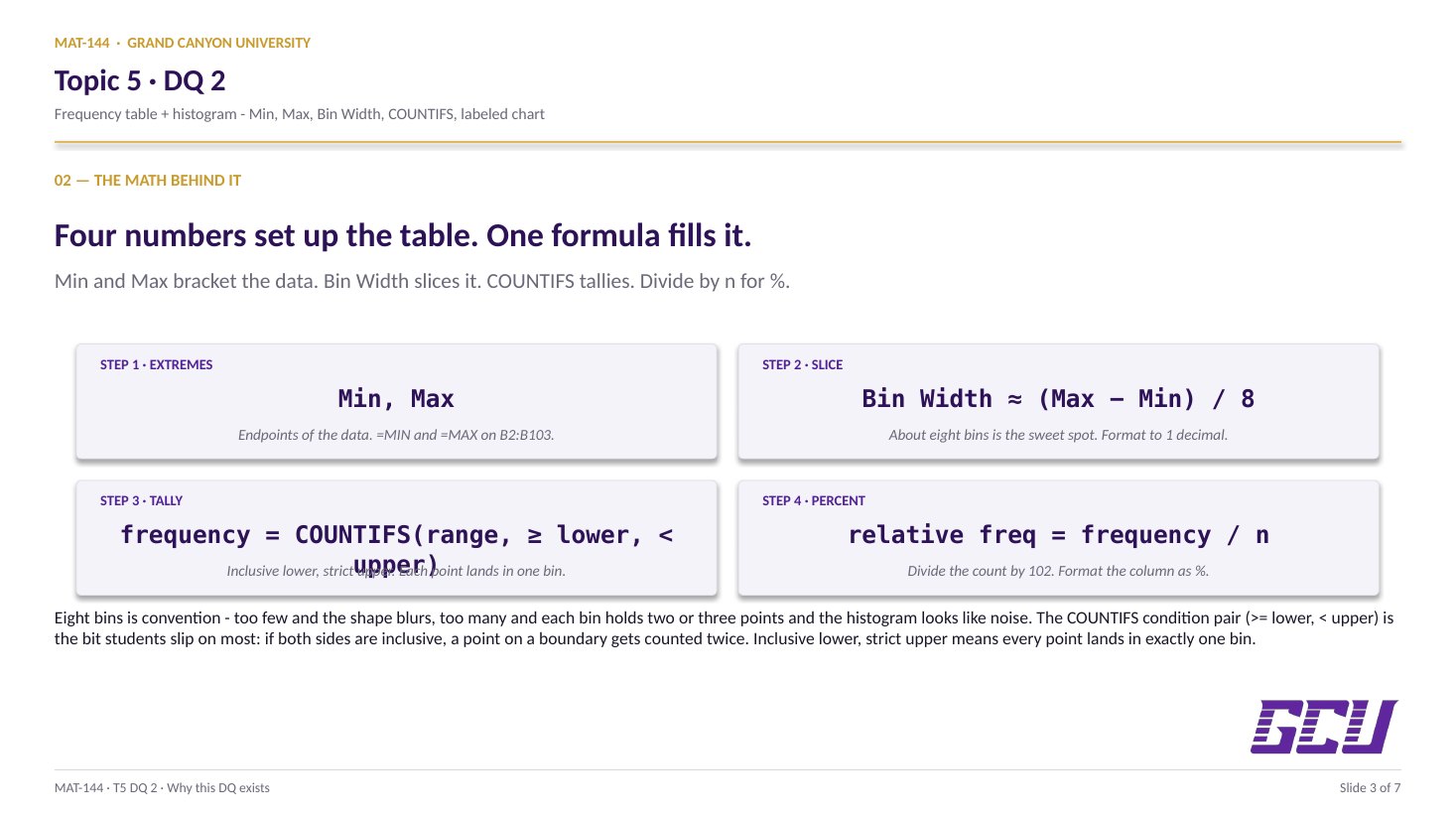
Min, Max, Bin Width.

Three numbers set up everything else: the minimum, the maximum, and the bin width. The first two come straight from built-in functions:

=MIN(B2:B103) in cell D5, =MAX(B2:B103) in cell D6. The functions ignore order and return exact endpoints — no manual sorting needed.

The bin width is your choice of resolution. A common rule of thumb is (max − min) / k for some sensible number of bins k (often 7 to 10 for a data set of size 100). Whatever you pick, format the three cells to 1 decimal place — the grader expects that precision.
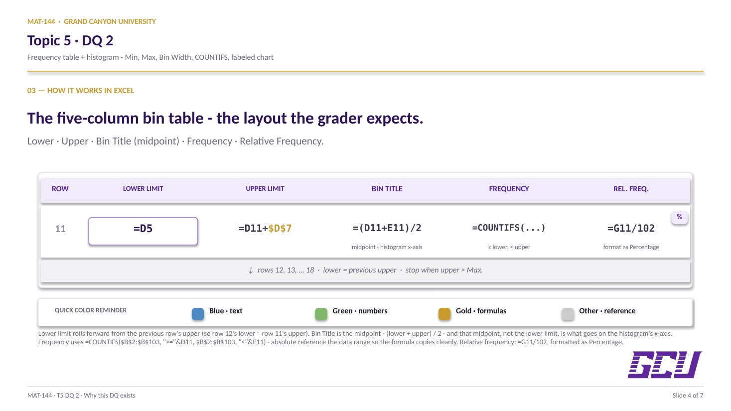
=MIN(B2:B103) → D5
=MAX(B2:B103) → D6
(D6D5) / k → D7
Two built-ins for the endpoints, one arithmetic step for the bin width. k is your choice of bin count (about 7–10).
02
Bin table

Lower, upper, midpoint title.

A bin is an interval on the number line. Each row of the frequency table is one bin, defined by a lower limit, an upper limit, and a midpoint that serves as the bin's name on the histogram x-axis.

Set the first lower limit to =D5 (the minimum). The first upper limit is the lower limit plus the bin width: =lower + D$7. Then the next row's lower limit is the previous row's upper limit (=E10), and so on. Stop when the upper limit reaches (or exceeds) the maximum.

The bin title is the midpoint: =(lower + upper) / 2. That's what gets plotted on the x-axis of the histogram — not a generic "Bin 1, Bin 2" index. Format all of these to 1 decimal place.

FREQUENCY-TABLE STRUCTURE lower upper title (mid) frequency =D5 =D11+D$7 =(D11+E11)/2 =COUNTIFS(...) =E11 =D12+D$7 =(D12+E12)/2 =COUNTIFS(...) =E12 =D13+D$7 =(D13+E13)/2 =COUNTIFS(...) · · · · · · · · previous upper → next lower bin titles (midpoints) become the histogram's x-axis labels
03
=COUNTIFS(
  $B$2:$B$103, ">=" & D11,
  $B$2:$B$103, "<" & E11
)
Two conditions, one cell: at least lower AND strictly less than upper. The & operator stitches the comparison together.
Counting in

=COUNTIFS with two conditions.

The frequency of a bin is the count of data values that fall inside it. Excel's =COUNTIFS() handles this with two conditions per call — one for "greater than or equal to the lower limit" and one for "less than the upper limit."

For the first bin, that looks like:

=COUNTIFS($B$2:$B$103, ">=" & D11, $B$2:$B$103, "<" & E11)

Notice the absolute references on the data range ($B$2:$B$103) and the relative references on the bin limits (D11, E11). Copy the formula down and the bin limits roll forward row-by-row while the data range stays pinned. The & operator concatenates the comparison operator with the cell value inside a single argument string.

04
Relative frequency

Divide by n, format as %.

The relative frequency is the proportion of the data set that lands in each bin: =G11 / 102, where G11 is the frequency and 102 is the total sample size. Equivalently, the sum of all relative frequencies must equal exactly 1 (100%) — a useful sanity check.

Format the relative-frequency column as Percentage with 0 decimal places. A value of 0.21 displays as "21%", which is how the grader reads it and how the textbook references it. The frequency column above stays formatted as a whole number (0 decimals).

Relative frequencies are what make histograms from data sets of different sizes comparable. Two surveys with n = 102 and n = 1,000 produce different raw counts in every bin, but if their relative-frequency histograms look the same, the two populations are distributed the same way.

relative freq = frequency / n
  = G11 / 102
format cell as % with 0 decimals
A bar of count 21 in a sample of 102 represents 21% of the data — the comparable unit across data sets of any size.
05
Histogram

Insert + three labels.

The histogram is built from two columns: the bin titles (your midpoints) on the x-axis and the frequencies (or relative frequencies) as bar heights. Excel makes this a two-click insert once the table is built.

Select the bin-title column and the frequency column together (hold Ctrl while clicking the second range), then go to Insert → Chart → Column → 2-D Clustered Column. The default chart is close, but three formatting moves are required:

(1) Chart title — click the title text and rename it (e.g., "Distribution of Water-Quality Changes Across 102 Wells"). (2) X-axis title — Chart Design → Add Chart Element → Axis Titles → Primary Horizontal; rename to "Change in water quality (midpoint of bin)" or similar. (3) Y-axis title — same path, Primary Vertical; rename to "Frequency".

The grader checks for all three. A chart titled "Chart 1" with default axes is the most common points-loss on this assignment.

DISTRIBUTION · 102 WELLS -5 2.5 10 17.5 25 32.5 40 47.5 change in water quality (midpoint of bin) frequency
Common slips

Five mistakes this DQ punishes.

Hardcoding values and forgetting axis titles are the two biggest points-loss items. Read these before you submit.

  1. 01
    Typed Min and Max manually instead of using =MIN / =MAX.

    The grader expects a formula in those cells. Use =MIN(B2:B103) and =MAX(B2:B103). Same for the bin width — reference the cells: =(D6-D5)/8, don't type the number.

  2. 02
    Used the lower-limit column as the bin title on the histogram.

    The bin title is the midpoint, not the lower limit. Compute it as =(D11+E11)/2 and use that column on the x-axis. A bar labeled "0" (the lower limit) is misleading; the bar represents data from 0 to 7.5, centered at 3.75.

  3. 03
    Used > instead of >= in COUNTIFS.

    The lower limit is inclusive: a data point exactly equal to a bin's lower limit should count in that bin. Use ">=" for the lower-limit condition and "<" (strict) for the upper-limit condition so each point lands in exactly one bin.

  4. 04
    Forgot to absolute-reference the data range in COUNTIFS.

    When you copy the formula down the bins, the limits should roll forward (D11 → D12 → D13) but the data range must stay pinned: $B$2:$B$103. Without the $, the range shifts down with each row and your frequencies are gibberish.

  5. 05
    Histogram missing chart title, x-axis title, or y-axis title.

    All three are required for full credit. Chart Design → Add Chart Element → Axis Titles → Primary Horizontal and Primary Vertical. Then click the chart title (Excel inserts a placeholder) and type a real title that names what the chart shows.

Application & connection

From this DQ into the margin of error in Lesson 6.

This DQ closes the descriptive half of Topic 5. DQ 1 computed center, spread, and a percentile band on the Improvement column. DQ 2 visualizes a different data set (Change in Water Quality, 102 wells) as a histogram — the picture that makes "approximately normal" obvious at a glance.

The bridge to Lesson 6 (margin of error) and the textbook chapter closer: once you can see that a sample is roughly normal, the Empirical Rule applies — and from there, margin of error follows almost mechanically. The histogram you build here is the bell curve sketch from Lesson 5, drawn with real data.

In practice: every poll, study, and survey result you'll encounter outside this class is summarized either as a descriptive number (mean, median, %) or as a histogram (the distribution). DQ 1 taught the first move; DQ 2 teaches the second.